


Designing a tech product for customer centricity: interview with product designer Aditi
Get to know product designer Aditi and the design process in the Hive product team


.svg)
.svg)
.svg)
Aditi Verma is a key member of Hive's product team. Before Hive, she worked in agencies across the US and India, consulting clients in multiple industries such as finance, insurance, automobile, communications, and healthcare. At Hive, she is primarily responsible for product design of the Hive WMS. We spoke to her about:
- Her motivations to get into design
- How the product design process works at Hive
- Her most impactful projects
- Plans for the future
What was your motivation to get into product design at Hive?
I started out in graphic design because I like how design systems work. Some of my previous experience was in brand design: doing print campaigns and adverts. I then moved into digital design and user experience (UX) in agencies, which I really enjoyed.
After some time I realized I was ready for the next challenge in a new industry. I wanted to have more direct ownership, confront problems head-on, have a range of stakeholders, and define research metrics myself.
Hive checks a lot of those boxes. Being in a startup comes with an element of ambiguity and I thrive in that. Working on the Warehouse Management System (WMS) is giving me the opportunity to carve a new path.
Could you walk us through the product design process at Hive?
At Hive, product and design are really closely intertwined. I focus largely on the WMS, so I’ll leave out our other products for now.
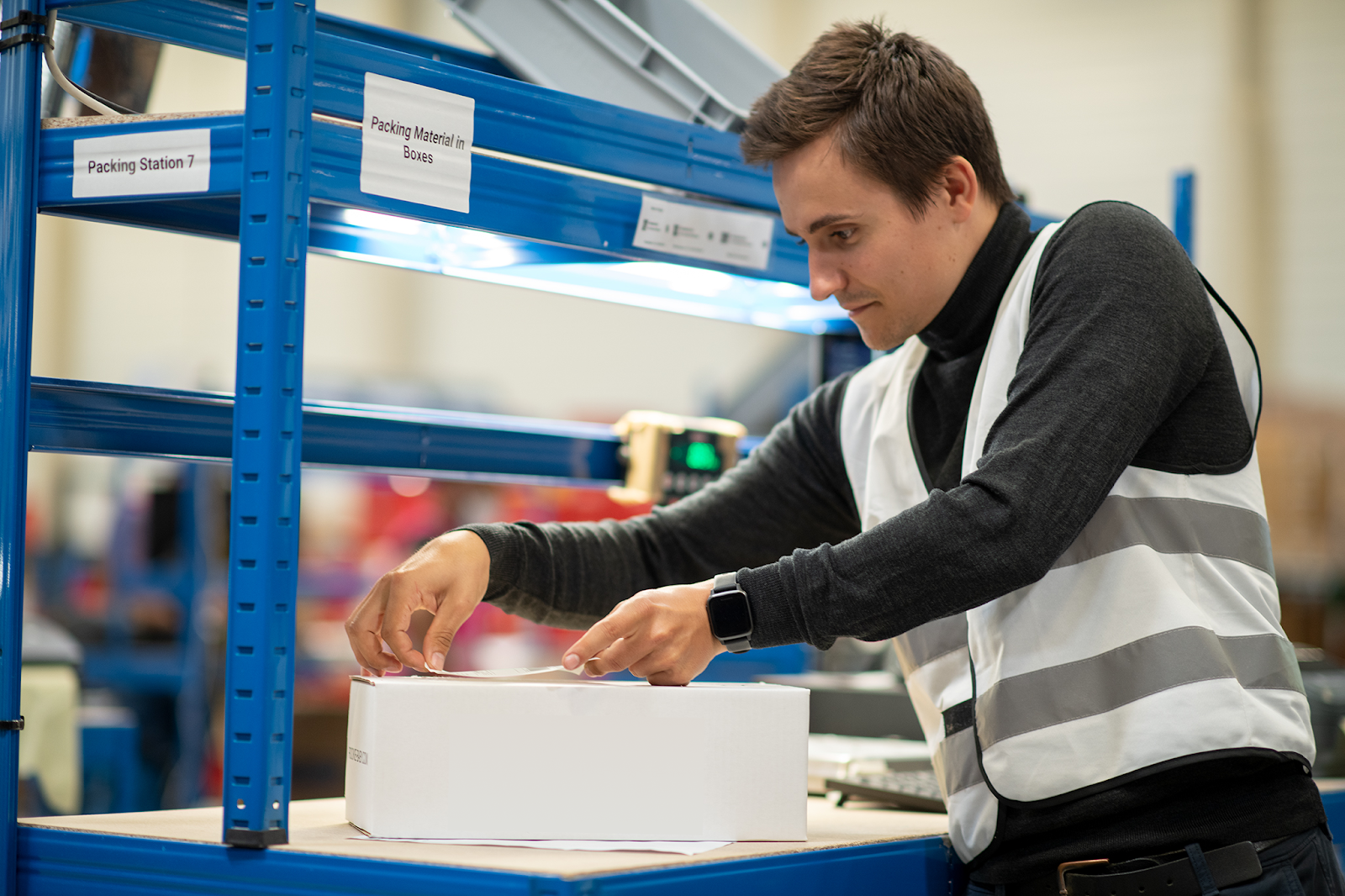
For the WMS the focus is on usability first, while always staying on brand. This is because the way the app functions has such a huge impact on the efficiency of our processes. I need to keep this in mind as the top priority when working through iterations of the design.
I spend a lot of time together with the product manager testing once development has started and regularly go to the FC to talk to stakeholders and share our designs in progress. We also record how users interact with the new designs and future iterations of the project.
A good example of this is when I changed the height of the buttons in our WMS. Being in the fulfillment center made me realize many of the men using the WMS have bigger thumbs than I do and hence need bigger buttons. This is something I would not have noticed if I wasn’t in the fulfillment center myself observing and testing my designs.
Plus, one of the interesting things about the WMS is that each process has different end users that use different devices. We tend to design mobile-first for a higher degree of mobility but for some aspects, for example, the packing screen, we need to prioritize desktop. I must keep all of this in mind when creating versatile, adaptable designs.

Can you give us an example of a particular project?
An interesting project was our kitting function. Kitting is when a merchant requests for two or more SKUs to be combined into one SKU in our fulfillment center. Producing a manual operational process like kitting was exciting because it put me in direct contact with both our merchants and our fulfillment center associates.
I created design documentation for these users and had various user research calls with merchants to get their feedback on what they expect from this feature, and compared that to the expectation guidelines from the product team.
We did another iteration round with our user groups once version one of the kitting feature was designed and got great feedback. In the end, we rolled out a successful feature, which saved up to 30 hours per week on manual request time for both our merchants and our customer service team.
How do you plan design for a company that is rapidly evolving in scale?
The thing with design is that there is never a perfect design and never enough research, especially as we grow and need to scale our processes. The WMS has been continuously growing and improving. When I first joined Hive, I was focused on updating our existing screens, improving the user interface (UI), and creating a design system.
Then, as we grew we started implementing more functionality. For our WMS, everything we build impacts the way we operate in our fulfillment center. Therefore, I have tight deadlines and need to make sure I create designs that are constantly validated by our users and will work in future iterations.
There are many complexities to balance with time constraints. For instance, as we grew across locations, we needed to incorporate additional languages. In order to keep complexity as low as possible, I started including more visuals instead of text.
Other complexities could be operational challenges such as ergonomic complexity (e.g. heavy boxes or pallets) and usability challenges, all while keeping the physical processes in the fulfillment center in mind. Even two extra clicks on a screen can slow down an order's processing time. So the flows have to be as simplified as possible without sacrificing quality.
.png)
Can you tell us a little more about a project you have found particularly impactful?
One of my favorite projects was creating guided inbound user flows. Inbound is the area in the fulfillment center where we receive goods from suppliers that need to be processed and stocked. This was a high-impact driver for both the fulfillment center and our merchants.
In this project, we combined three complex inbound processes into one flow.
- First, we identify shipments as they come in so we know which merchant they belong to, and what we expect the contents to be.
- We then receive and process the shipments (we count the included goods and verify the content of each shipment). In this step, we are able to accurately announce the number of goods that we have received and flag if there are any problems such as damaged or missing goods.
- Lastly, we restock the goods to their respective containers.
Why did we rework this process? Merchants asked for more transparency, and this allowed us to show them more detailed data, for example, discrepancies with the supplier. Our new guided flows reduce the processing time of an inbound shipment and give more transparency towards brands.
It was my favorite project because of its level of complexity. At one point I had 27,000 frames in my design with over 300 comments, so you can imagine how many iterations I went through.
This goes back to what it is like designing in a company that is growing fast: processes that are fundamental to our operations have to be thoroughly tested and bullet-proof. We have a really high standard for quality.
We also got great feedback on the designs and validation from our users in the fulfillment center. They did not have many questions about the feature, because it was so intuitive to use.
.jpg)
What is a project you are excited to work on in 2023?
Given that inbound was such a success we are carrying that spirit forward with returns processing at the FC which will be a high-impact driver for the merchant as well. We can produce an easier flow for identifying, documenting, and processing the returns. We will cut a lot of loops, increase transparency and simplify processes for our merchants.
Anything you’d like to sign off with?
What I’ve learned with our WMS is that “when in doubt… delete”.
.png)
.svg)


.jpg)


.jpg)
.png)